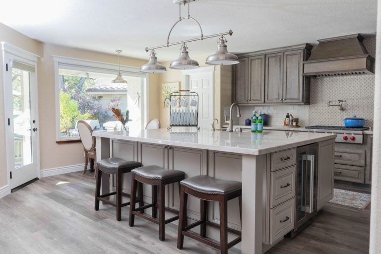
Color has a profound influence on space and the people in it. As interior designers, we have long used this tool to enhance a room’s energy, influence a mood or encourage a specific activity in an area. Bold colors can make a loud design statement, and pastels create a soft, subtle ambiance. Bright colors can liven up an otherwise bland space, while neutrals act as a blank canvas. We’d love to share our insights when thinking about adding color to your home remodel.
Red
The color red is the most vibrant color that represents emotions. Whether dark or light shades, they create an atmosphere of love and camaraderie. Implementing red in your design plans adds excitement and vigor to the room.
Orange
The vibrant color orange symbolizes sunshine and nature. Orange and all its shades have a positive effect on the psyche. One way to use the vibrant color of orange by toning it down is to use natural and neutral shades on the walls for a calming effect. Then introduce hanging lamps in orange patterns or use orange chairs and cushions to tie the room together.
Yellow
Yellow is synonymous with sunshine, spreading the effect of light and happiness. Yellow is also associated with intellect and prosperity due to its close association with the color gold. In interior design, yellow is commonly used for the kitchen, dining areas, hallways, and bathrooms. The color automatically uplifts people’s spirits making the room bright and sunny. It is best to use yellow in its bright shades around the house. Dull yellow colors typically instigate a negative feeling.
Green
The color green is a highly versatile color. Different shades of green promote different emotions, commonly reminding people of nature. Green works well in different shades throughout the house. You can use lighter shades on the walls and contrast dark shades of green with plants. The color green mostly has a calming effect with a sense of security, which makes it an ideal color for interior design.
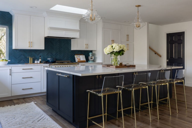
Blue
Blues and aquatic shades of blue, such as sky blue and light blue, have a healing effect on the mind. It resonates with the sea or swimming pools. Because blue curbs appetite, it is probably best not to use it in the kitchen or dining room, but its effects could be great for an office or bathroom. Dark shades of blue are associated with elegance, luxury, and royalty, while Sapphire colors add prominence to the design plan.
Purple
The color purple is usually associated with elegance and royalty. Purple color schemes work well in areas that inspire creativity and design. Bright hues of purple such as violet or plum, add flair to your design scheme. Whereas lighter shades of purple such as lavender and mauve, create a calm but regal effect in your design. Purple inspires creativity. Add it to dressing rooms, walk-in closets, in-house art studios, or even the kitchen.
Black
The color black has always fared well with versatility and elegance. Black signifies simplicity and functionality. This color works best in modern interior design and architecture.
White
White is a robust color scheme with different shades of white such as ivory, widely used as a standard color for walls, eggshell, and many more. Beige combines color scheme but still serves well on a white palette. The color white is associated with peace and tranquility.
Consider the room and its purpose when making color selections. Color is integral to every design, reflecting your personality with color schemes that make you feel comfortable. At K Square, our interior design professionals can help implement color to your existing home or new home remodel. We offer professional interior design services and home remodeling construction.